01 The Problem Space
"In the cloud, scale creates blindness."
A single production environment generates millions of activity logs daily. When a critical outage occurs, the root cause is often a micro-configuration drift—a changed port or a downgraded SKU—buried within gigabytes of raw JSON data.
The Black Box Effect
Without a visual layer, the infrastructure effectively becomes a "Black Box," rendering rapid root cause analysis mathematically impossible during high-pressure incidents.
Core Frictions
Signal Drowned in Noise
The ratio of "useful signals" to "system noise" is often 1:10,000. Manual detection is unscalable and prone to fatigue-driven errors.
Lack of Semantic Context
Raw logs show activity but not intent. In code, a systematic "Update" looks identical whether it is a routine patch or a catastrophic deletion.
The Cost of Ambiguity
Without a "Diff View" (Before vs. After), the system offers no baseline for comparison, turning troubleshooting into a high-risk guessing game.
02 Design Iteration
The Pivot: From "Data Dumping" to "Pattern Recognition"
Phase 1: The Trap of "List Thinking"
Early concepts focused heavily on maximizing data density via a raw grid. However, usability testing revealed a critical flaw: While Admins could find specific records, they failed to spot systemic anomalies.
Phase 2: The Visual Shift
We realized that context is speed. We pivoted from a text-heavy layout to a "Visual-First" hierarchy.
The Pivot: From "Ambiguity" to "Precision"
Phase 1: The "Metadata" Trap
The initial detail view focused on metadata—who made the change and when. However, the actual configuration payload (JSON) was hidden or required downloading raw logs to analyze.
Phase 2: The "Diff" Integration
We moved from "logging" to "investigation." We integrated a developer-grade Side-by-Side Diff View directly into the portal.
03 The Solution
The final design consolidates complex workflows into a unified interface. Below are the key views highlighting the core interactions and visual hierarchy.

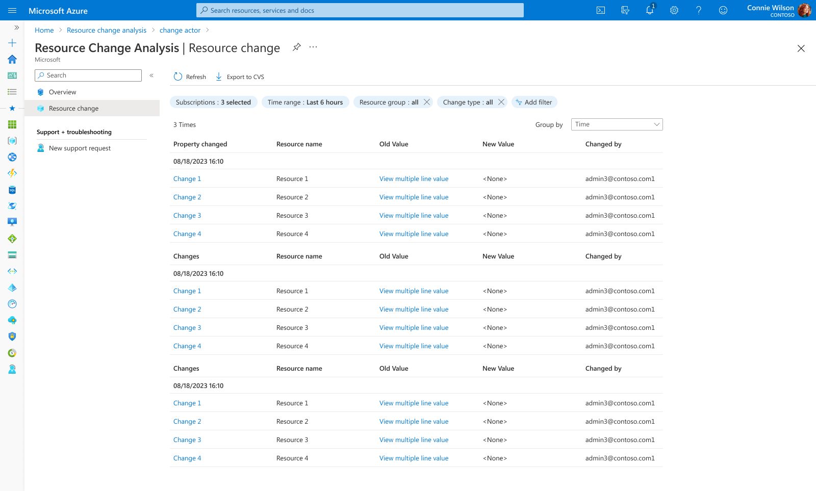
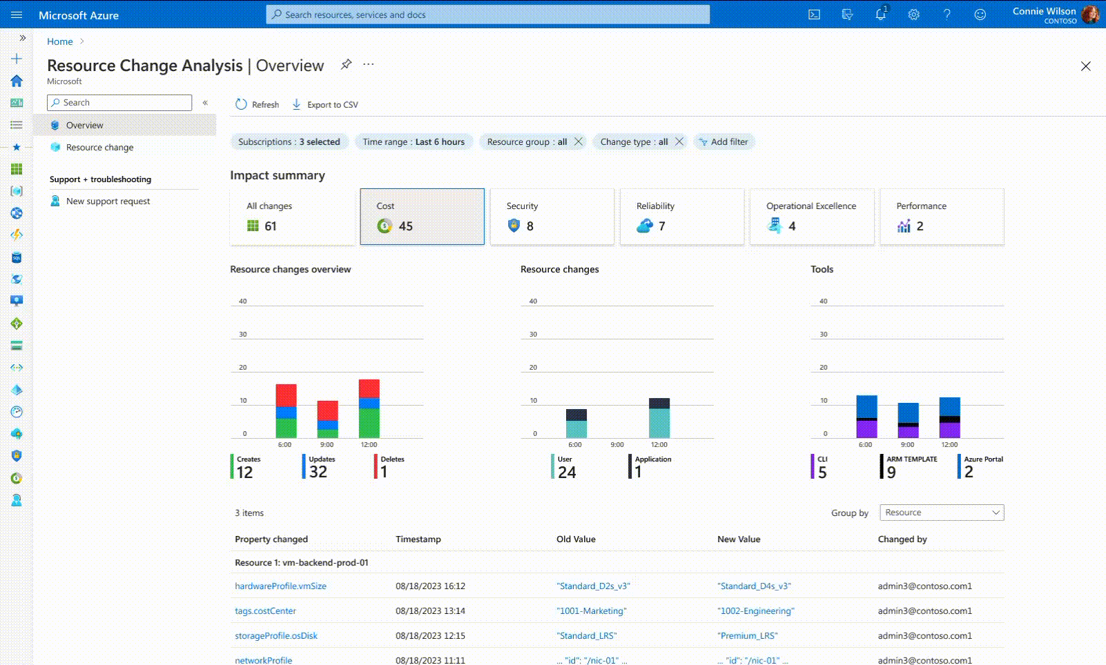
Global Observability & Dynamic Filtering
Global Observability
A unified 'Control Tower' that correlates activity, risk, and time. Features interactive Impact Cards that act as global filters—clicking specific cards (e.g., Cost, Security) dynamically updates the bar charts and re-groups the change list. This allows Admins to slice through noise and isolate specific risk vectors in real-time.

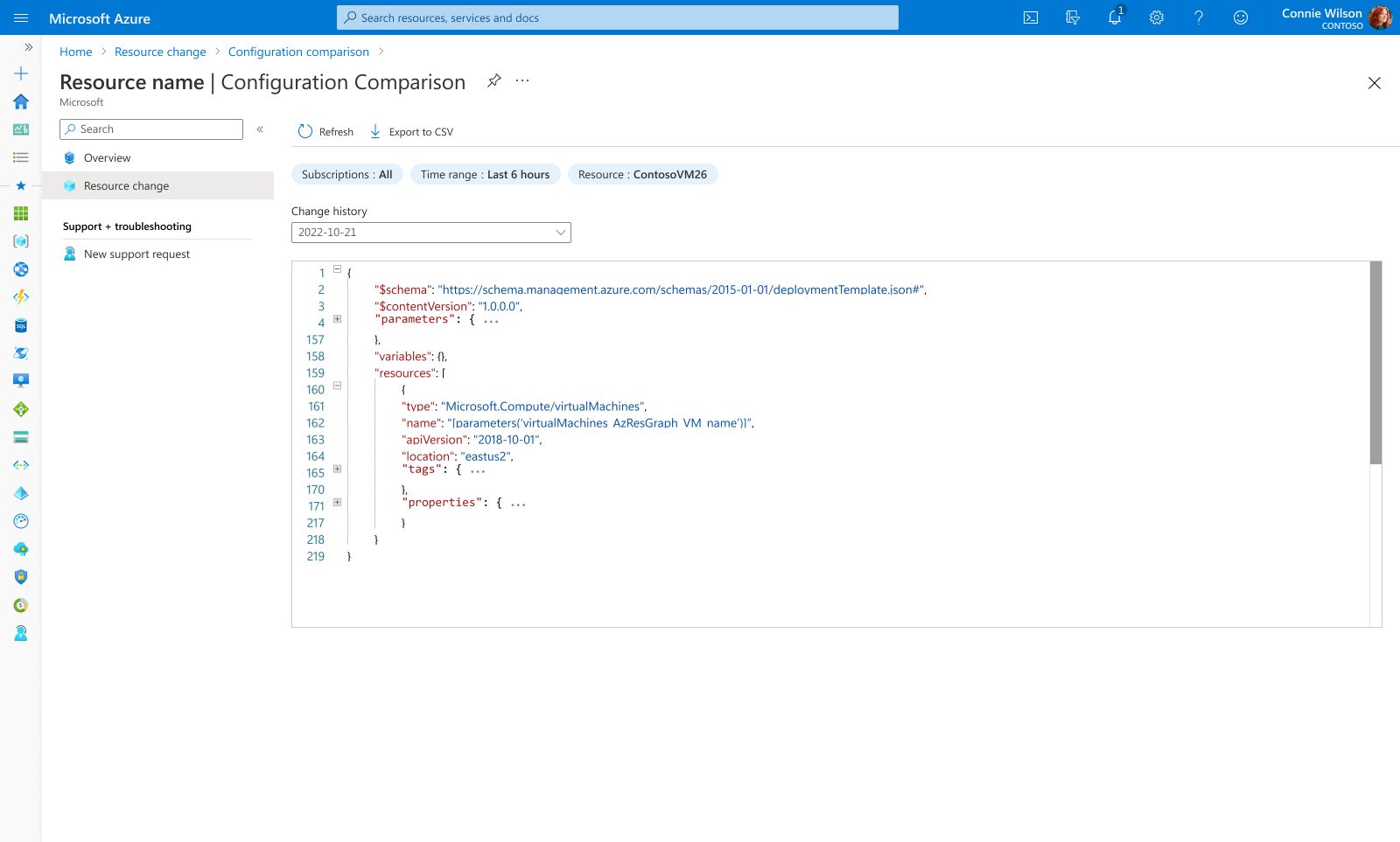
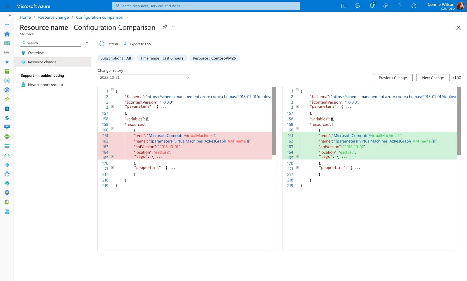
Visual Diff Inspector
Design Highlight
To reduce "configuration drift," we implemented a side-by-side visual diff. This highlights added (green) and removed (red) lines of code in real-time, empowering users to validate complex JSON changes with confidence before committing to production.
04 Impact & Learnings
We turned anxiety into action. By visualizing the invisible, we replaced the fear of guessing with the confidence of knowing.
Trust is built on transparency.
The biggest lesson from this project wasn't just about data visualization—it was about user confidence . Previously, Admins hesitated to fix issues because they couldn't 'see' the consequences. By exposing the exact 'Before & After' states (Diff View), we didn't just save time; we removed the fear of making mistakes. In enterprise tools, clarity is the ultimate form of empathy.